Stop Generating State Props: Figma Variants Are Not CSS
If you have spent any time in Figma's documentation, you will have seen the button example. It is their go-to for explaining variants: a button component with properties for size, style, and state — default, hover, focus, active, disabled. It looks tidy in the design file. It makes sense as a way to document what happens visually. The problem starts when AI tools take that structure and turn it into code.
I wrote about my first week with Figma's MCP server a while back and touched on some of the rough edges. This is a deeper look at one specific issue that I think is genuinely damaging if it ships unchecked: interactive states being modelled as component variants rather than CSS pseudo-classes.
How Figma models interactive states
In Figma, a button component might have a variant property called State with values like Default, Hover, Focus, Active, and Disabled. This is how Figma's own documentation demonstrates it. It is a sensible approach for designers — it lets them visually document every state of a component in one place, toggle between them in prototypes, and hand off a clear picture of what each state should look like.
The issue is not with Figma. It is with what happens next.
What AI generates from this
When you connect a Figma file to an AI coding tool — whether through the Figma MCP server in Cursor, or any other design-to-code pipeline — and ask it to build that button, you tend to get something like this:
interface ButtonProps {
  variant: 'primary' | 'secondary';
  size: 'sm' | 'md' | 'lg';
  state: 'default' | 'hover' | 'focus' | 'active' | 'disabled';
  children: React.ReactNode;
}

const Button: React.FC<ButtonProps> = ({ variant, size, state, children }) => {
  const stateStyles = {
    default: 'bg-blue-600 text-white',
    hover: 'bg-blue-700 text-white scale-105',
    focus: 'bg-blue-600 text-white ring-2 ring-blue-400 ring-offset-2',
    active: 'bg-blue-800 text-white scale-95',
    disabled: 'bg-gray-300 text-gray-500 cursor-not-allowed',
  };

  return (
    <button className={`${stateStyles[state]} px-4 py-2 rounded`}>
      {children}
    </button>
  );
};
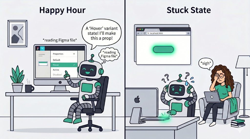
The AI has done exactly what you asked. It read the Figma file, saw State as a variant property, and created a state prop. The code is valid. It compiles. It looks like it does the right thing.
It is completely wrong.

Why this is bad implementation
A state prop for hover or focus fundamentally misunderstands how interactive states work in the browser. Nobody writes <Button state="hover"> in their application code. Hover is not a prop you pass down — it is something that happens when a user moves their cursor over the element. Focus is not a value you set — it is a browser-managed state triggered by keyboard navigation or clicking.
Here is what would actually happen if you tried to use that component:
// How would you even use this?
<Button state="hover">Click me</Button>

// The button is ALWAYS in hover state.
// Moving your mouse over it does nothing.
// Moving your mouse away does nothing.
// It just sits there, permanently "hovered".
To make it actually respond to user interaction, you would need to wire up event handlers to toggle the state prop — essentially rebuilding what CSS gives you for free:
const [buttonState, setButtonState] = useState<'default' | 'hover'>('default');

<Button
  state={buttonState}
  onMouseEnter={() => setButtonState('hover')}
  onMouseLeave={() => setButtonState('default')}
>
  Click me
</Button>
You have now used JavaScript to replicate what CSS has done natively since 1998. And you have done it worse, because this does not handle touch devices, does not work with keyboard navigation, introduces unnecessary re-renders on every mouse enter/leave, and breaks if the component is used in a context where the parent forgets to wire up the handlers.
What should actually happen
Interactive states belong in CSS. Full stop. Here is the same button, done properly:
interface ButtonProps {
  variant: 'primary' | 'secondary';
  size: 'sm' | 'md' | 'lg';
  disabled?: boolean;
  children: React.ReactNode;
}

const Button: React.FC<ButtonProps> = ({ variant, size, disabled, children }) => {
  return (
    <button
      disabled={disabled}
      className="btn px-4 py-2 rounded bg-blue-600 text-white
        hover:bg-blue-700 hover:scale-105
        focus:ring-2 focus:ring-blue-400 focus:ring-offset-2
        active:bg-blue-800 active:scale-95
        disabled:bg-gray-300 disabled:text-gray-500 disabled:cursor-not-allowed"
    >
      {children}
    </button>
  );
};
Or if you prefer vanilla CSS:
.btn {
  background-color: #2563eb;
  color: white;
  padding: 0.5rem 1rem;
  border-radius: 0.25rem;
  transition: all 150ms ease;
}

.btn:hover {
  background-color: #1d4ed8;
  transform: scale(1.05);
}

.btn:focus-visible {
  outline: 2px solid #60a5fa;
  outline-offset: 2px;
}

.btn:active {
  background-color: #1e40af;
  transform: scale(0.95);
}

.btn:disabled {
  background-color: #d1d5db;
  color: #6b7280;
  cursor: not-allowed;
  transform: none;
}
No state prop. No event handlers. No re-renders. The browser handles hover, focus, and active natively. The disabled attribute is the only one that crosses into prop territory, and that is because disabled is an actual HTML attribute that changes the element's behaviour — it is not just a visual variant.
The Figma documentation reinforcement loop
This is where it gets interesting. Figma's documentation consistently uses interactive states as the primary example when teaching variants. Open up their help article on creating and using variants and you will find this exact passage:
"Variant properties are the variable aspects of our component. For example: the properties of a button component could be the size, state, or color. Values are the different options available for each property. For example: the state property could have default, hover, pressed, and disabled values."
Button state is literally the canonical example. And it is not just Figma's own docs — this pattern is everywhere in the Figma Community. Some well-known examples:
- Material Design 3 Design Kit — Google's official M3 kit models button states (Enabled, Hovered, Focused, Pressed, Disabled) as variant properties
- Shopify Polaris Buttons — state variants for Default, Hover, Focus, Active, Disabled
- Button Component System — Variant, State & Size Ready — Primary, Secondary, Ghost with Default, Hover, Pressed, Disabled states
- Button States-Variants and Component Properties — explicitly built around Default, Hover, Active, Focus, Disabled as variant values
There is even a Button States Generator plugin that automates creating these variant states. The pattern is so deeply embedded in Figma's ecosystem that it would be stranger not to do it this way.
Nathan Curtis wrote a brilliant piece called "The Sorry State of States" that digs into exactly this tension — how design tools model states in a way that does not map cleanly to how code should implement them.
All of this makes perfect sense from a design tool perspective. Designers need to specify what a hover state looks like, and Figma's variant system is how you do that. But it creates a reinforcement loop. AI models have been trained on Figma's documentation. They have seen thousands of Figma files — including the ones above — where hover is a variant. When they encounter a Figma component with a State property, they do the most logical thing: they create a state prop. The model is not wrong about what the design file says. It is wrong about what the code should do.
This is a translation problem, not an AI problem. The same information means different things in different contexts. In Figma, "Hover" is a visual specification. In code, "hover" is a CSS pseudo-class. The AI does not know the difference because, as far as it can see, the design file is the source of truth.
What about Storybook?
Someone might argue that a state prop is useful for Storybook, so you can show each state in isolation. It is a fair thought, but there are better ways.
Storybook has the pseudo-states addon which lets you force :hover, :focus, :active, and other pseudo-classes on a component without needing a prop for it:
// Button.stories.ts
import type { Meta, StoryObj } from '@storybook/react';
import { Button } from './Button';

const meta: Meta<typeof Button> = {
  component: Button,
};

export default meta;
type Story = StoryObj<typeof Button>;

export const Default: Story = {
  args: {
    children: 'Click me',
    variant: 'primary',
  },
};

export const Hover: Story = {
  args: {
    children: 'Click me',
    variant: 'primary',
  },
  parameters: {
    pseudo: { hover: true },
  },
};

export const Focus: Story = {
  args: {
    children: 'Click me',
    variant: 'primary',
  },
  parameters: {
    pseudo: { focus: true },
  },
};

export const Disabled: Story = {
  args: {
    children: 'Click me',
    variant: 'primary',
    disabled: true,
  },
};
This lets you demonstrate every visual state without polluting your component API with props that have no business being there. The component stays clean. Storybook does the forcing. Real usage in your app is just <Button variant="primary">Click me</Button> and CSS handles the rest.
The middle layer problem
I think this points to a bigger issue with design-to-code tooling in general. There is a translation layer between what a design file represents and what production code should look like, and right now that layer is either missing or doing a poor job.
Figma represents visual intent. Code represents behaviour and interaction. They are not the same thing, and a one-to-one mapping between them will always produce questionable output. A hover variant in Figma says "this is what it should look like when hovered." The code equivalent is not a prop — it is a pseudo-class, a transition, and maybe a transform.
This is where developers are still essential. Understanding the difference between what a design describes and what the code should do is the craft. AI without that understanding, without guardrails, will keep generating state props for hover effects. And if nobody catches it, that code ships.
What I'd like to see
A few things that would help:
- Figma could annotate variants with intent. If a variant property is tagged as "interactive state" rather than "visual variant," code generation tools could treat it differently. This metadata does not exist today.
- AI tools need better heuristics. If a variant is called "hover", "focus", "active", or "pressed", the code generator should know to emit CSS pseudo-classes, not props. This feels very solvable with rules or post-processing.
- Cursor rules and guardrails matter. I wrote about using AI well before, and this is another case where having explicit rules in your project (like "never create state props for interactive states, use CSS pseudo-classes") can steer the output. If you are using the Figma MCP server, this should be in your Cursor rules file.
The takeaway
Figma is a design tool. It models things in a way that makes sense for design. AI faithfully translates that model into code. The result is code that looks right but behaves wrong. The fix is not to blame Figma or the AI — it is to recognise that design-to-code is a translation, not a transcription, and someone needs to understand both languages.
If you are using the Figma MCP server or any design-to-code tool, check the output for state props on interactive elements. If you see state="hover" in a component, that is your cue to refactor. The browser already knows what hover is. Let CSS do its job.
If you found this useful, you might also want to read my earlier post on Figma MCP servers for the broader picture, or my thoughts on vibe coding and when AI is not enough.